
hello@maygan.net
Halika Detours Studio LLC © 2026

menu
close
Lead Brand + Product Designer — strategy, identity, product experience, and design system. Independent engagement, end to end.
The tech worked. But how could we make it feel intuitive and familiar?
Vibeset had built something real — AI-powered music intelligence, hallucination checks, a full curation backend. The engineers had a working prototype.
The problem: We were interested in exploring how we could differentiate from other platforms like Spotify DJ, Apple Music, Tidal - rather position Vibeset to be a supporting friend to them. Like many early-stage AI products, the challenge wasn't just building the technology — it was making the value legible. My role was to translate that complexity into a brand and product experience that felt understandable, differentiated, and credible.
What they were building: Deep curation tech, AI-powered music intelligence, and multi-modal UX for music experiences.
Why it mattered: Music connects people, but curation can feel intimidating, time-intensive, and culturally gatekept.
What the brand had to do: Translate an emerging AI concept into something understandable, credible, and engaging.
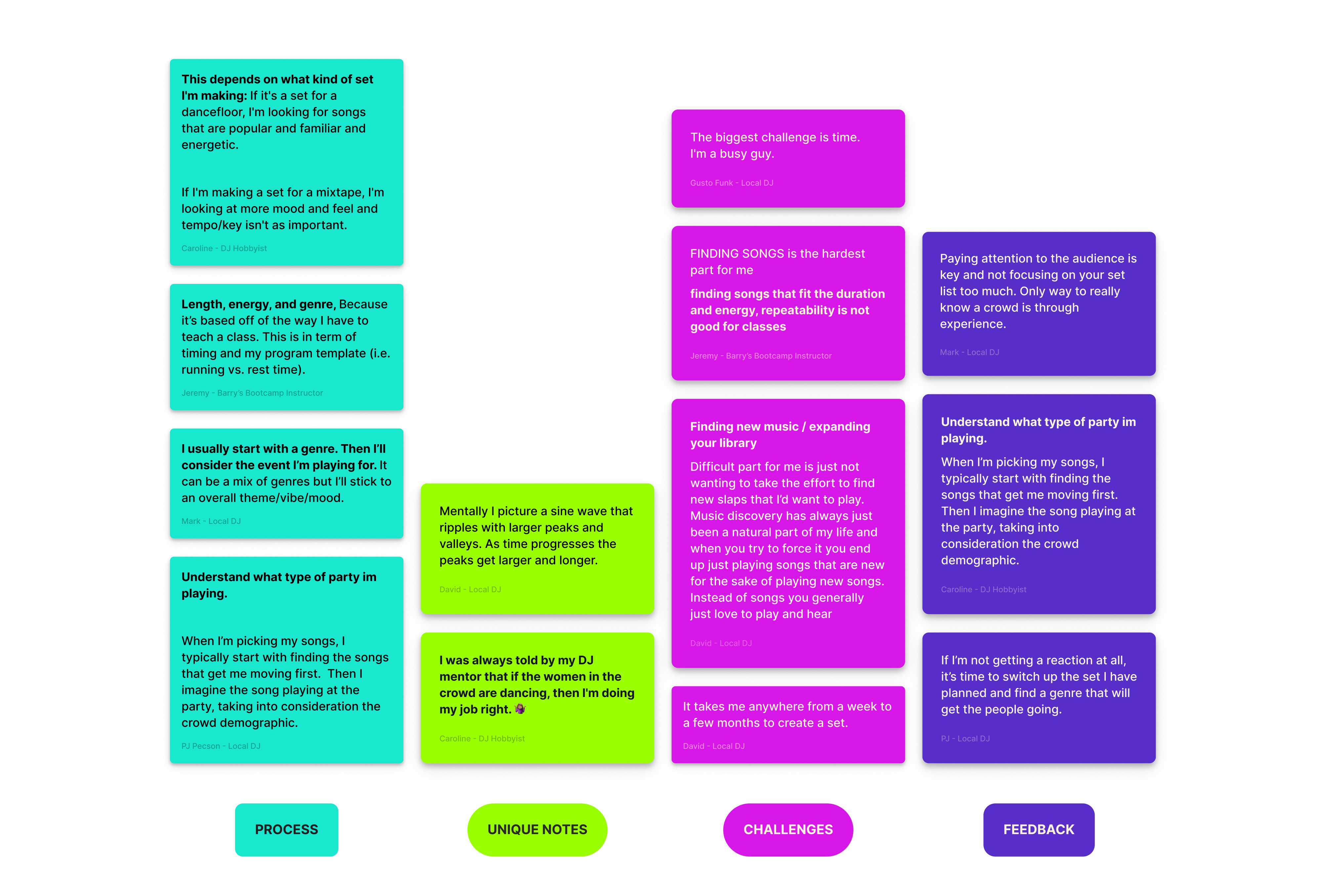
DJs, fitness instructors, and music hobbyists. User interviews revealed something that completely reframed the brief — these weren't people who wanted AI to replace their instincts. They wanted AI to support them.
I needed to understand what real curation felt like before I could design an AI experience on top of it.
Visual Northstar: as a sine wave — peaks, valleys, and energy — not as tracks and titles. That single observation became the foundation of the entire visual language.
The original brief assumed users would tell the AI what they want and get a setlist. The research told a different story.
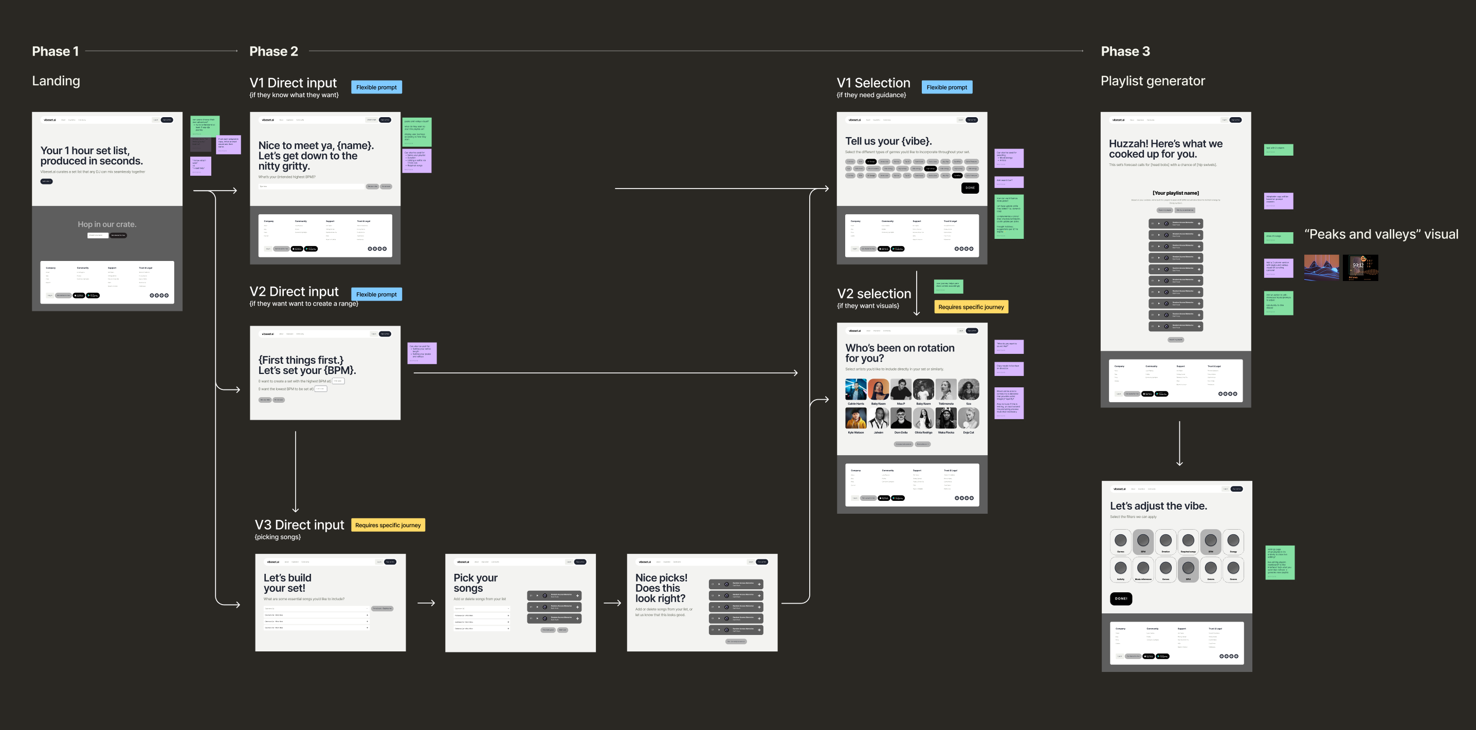
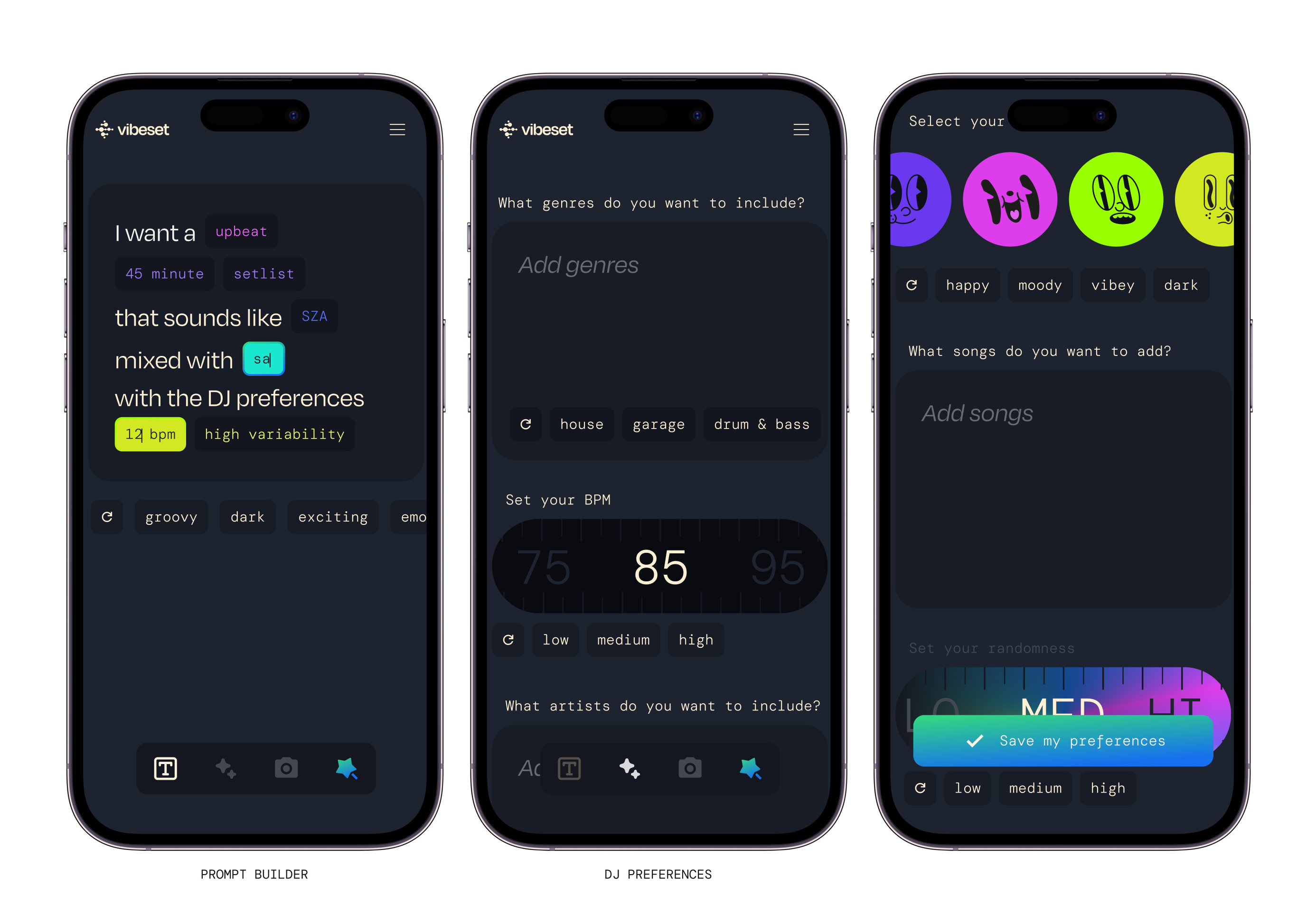
✍🏼 Version 1 - Natural Language: for users who know exactly what they want
Freeform prompt input. The AI interprets intent and generates a setlist directly. Fast, open-ended, for experienced curators.
🧭 Version 2 - Guided Prompting: for users who need scaffolding
BPM selection, valence, genre, mood — structured inputs that guide the AI step by step. Reduces decision fatigue for newer users.
🧠 Version 3 - Direct Song Input: for users who think in tracks
Build by picking, not describing. Users select specific songs and artists; the AI fills in the gaps and builds the set around them.
The decision
Three journeys, three mental models; the difference between AI that feels helpful and AI that feels presumptuous. Designing the input experience was the product design.
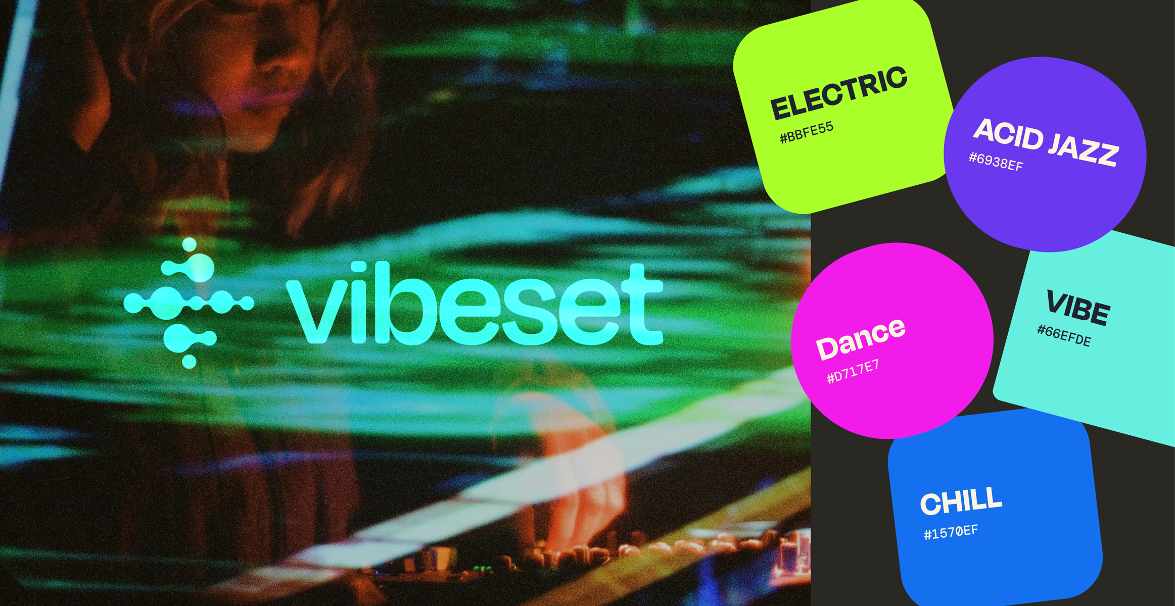
The visual language was the hardest problem. How do you make AI feel alive without making it feel like a screensaver?
I went through multiple directions — hyperrealistic gradients, abstract energy forms, motion-first concepts. What kept surfacing: every visual element had to feel like it was responding to something, not just displaying it.
The waveform, the valence grid, the BPM visualizations — all were designed around how DJs actually experience music, not how streaming apps represent it.
Following the successful MVP build, Vibeset was still discovering what it was. The design system had to flex with it — not lock it down. From MVP to beta launch to system evolution, every decision was made to be experiemental.
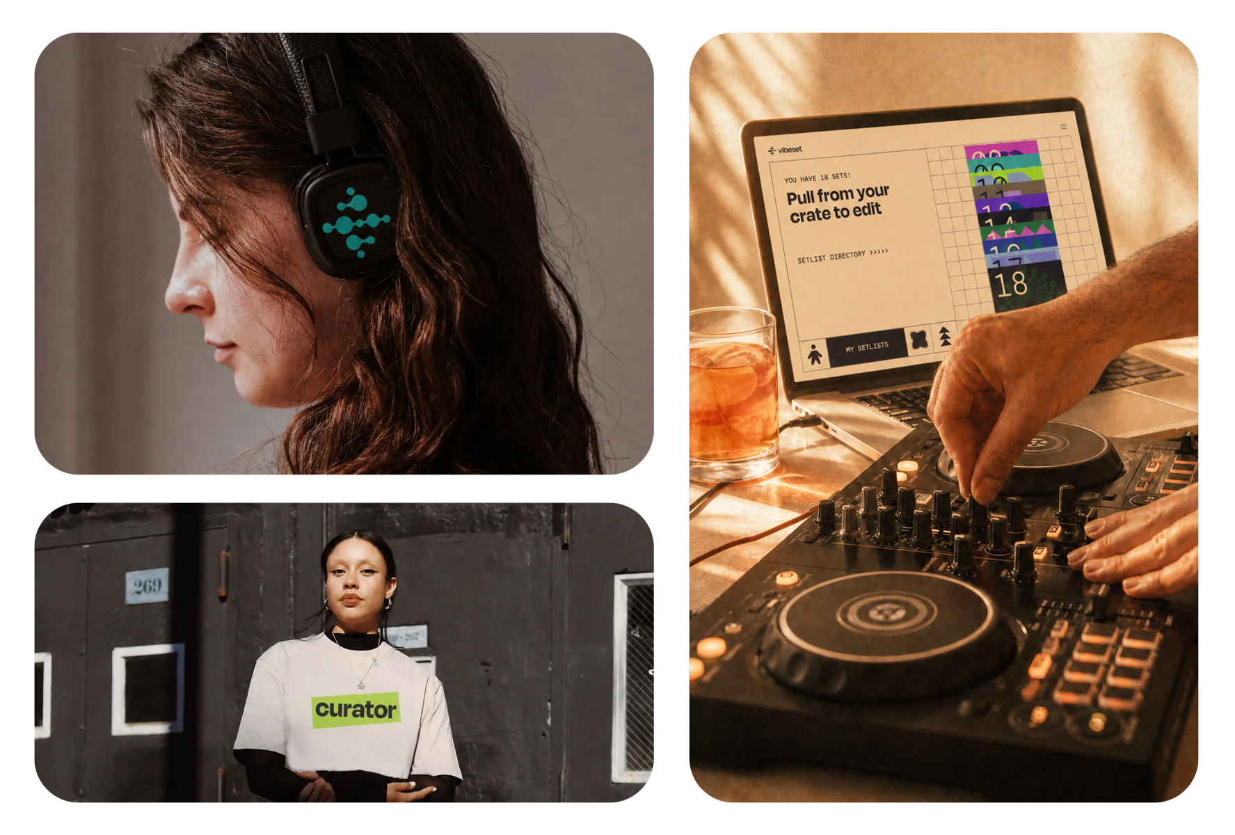
The system became more open-ended, more reusable, and better aligned with the product’s long-term needs. For me, that was one of the clearest signs of progress: the work was moving from isolated design moments toward a stronger foundation the product could grow from.
Go wild to mild — Staying empathetic and curious gave us more room to explore ideas that felt fresh, intuitive, and human.
Reduce reactivity — Too many reactive shifts created drag and made it harder to maintain a coherent product and brand direction.
Consider the long game — Over-indexing on bespoke creative introduced unnecessary complexity into the system.
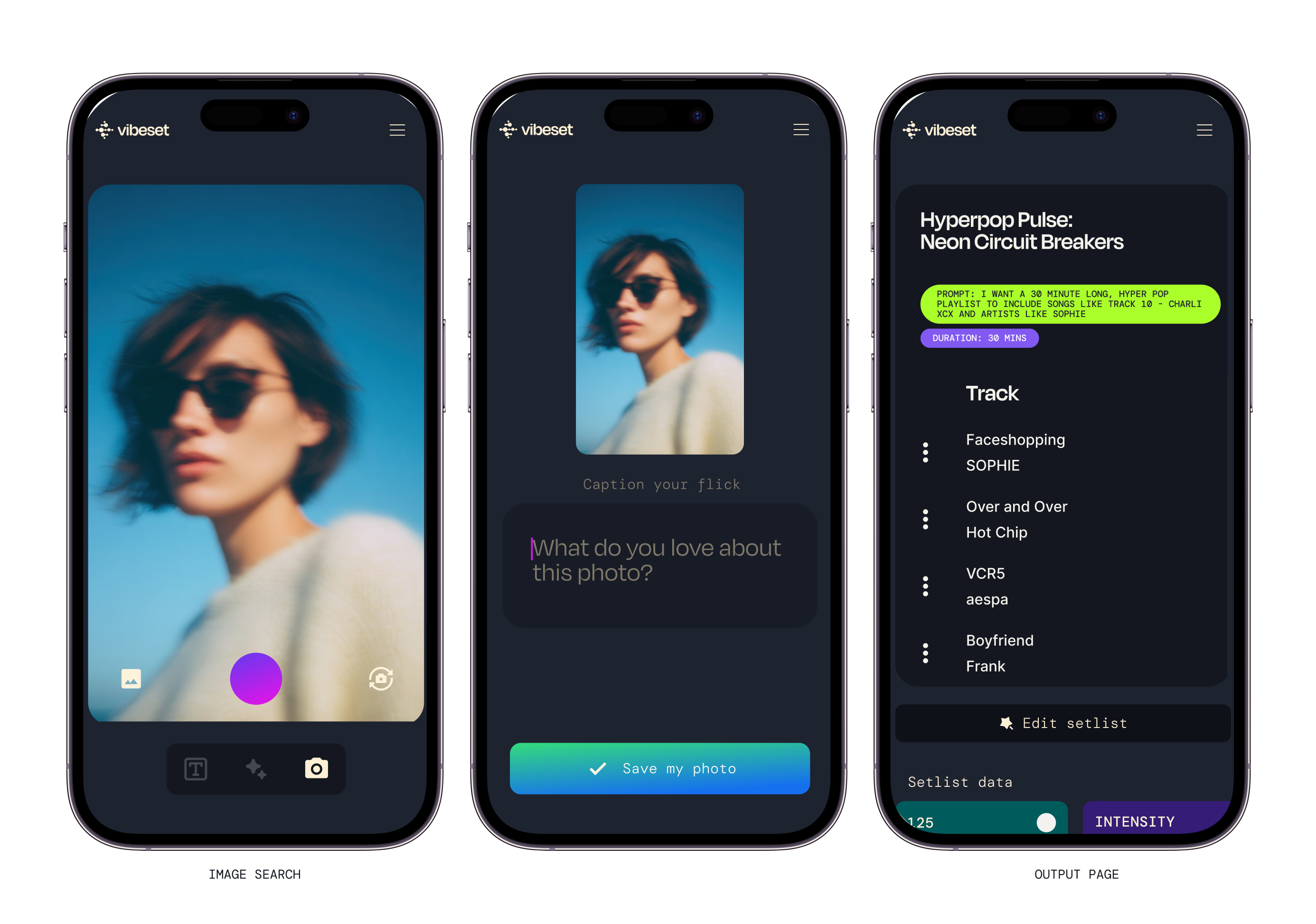
See it in action, create your own setlist here.


