
hello@maygan.net
Halika Detours Studio LLC © 2026

menu
close
SAP sought to evolve its visual language to better balance technical authority with a more innovative, human, and forward-thinking spirit. I was tasked with exploring new art directions that honored SAP’s structural rigor while unlocking a more expressive creative system.
Please note: Additional motion and strategy artifacts are currently being integrated into the case study - sit tight!
The Challenge: Dreaming with Structure
I was tasked with challenging SAP’s current brand expression through multiple visual lenses that test how far the brand can stretch toward creativity and innovation without compromising enterprise credibility.
The Insight: Credibility Was the Foundation, Innovation Was the Opportunity
SAP is highly credible, but its current expression risks over-indexing on function and familiarity. The opportunity was not to replace that credibility, but to evolve it into something more emotionally resonant, creatively expansive, and visibly innovative.
My role: Senior Brand Designer focused on visual strategy, brand audit, art direction, system exploration, and application testing across campaign, digital, editorial, and environmental touchpoints.
Understanding the Brand Archaeology
I conducted a deep audit of SAP’s historical visual language to identify the underlying structural DNA and uncover opportunities to evolve without diluting brand equity.

SAP’s strongest visual equity was not only its blue. It was the recurring use of angular geometry, modular framing, and structured information systems. These became the foundation for a refreshed expression that could feel both familiar and more future-facing.
While SAP’s current identity cues support recognition, the system relies heavily on the logo and leaves room for a more expansive set of brand behaviors. This created an opportunity to strengthen secondary devices, especially shape and composition, so the brand could communicate with more fluency, flexibility, and emotion.
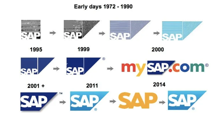
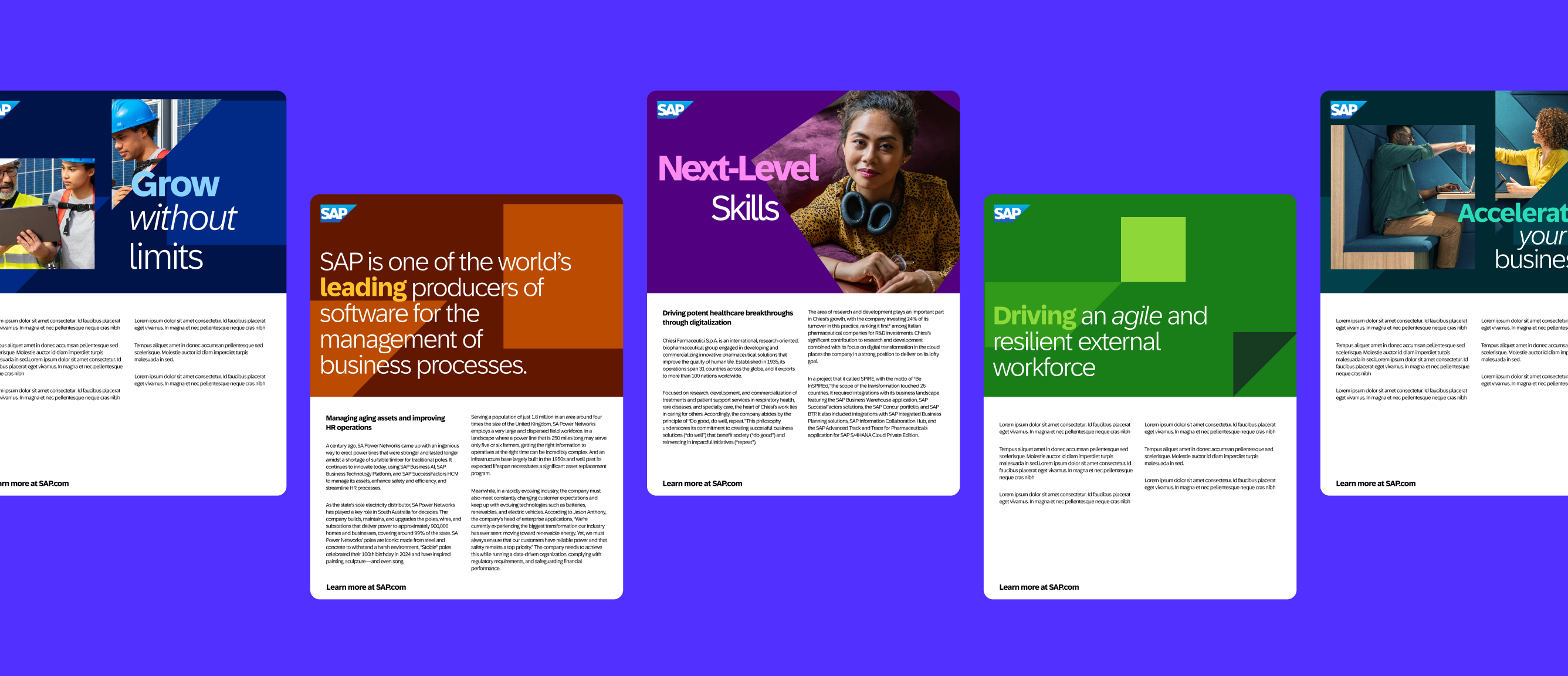
SAP’s Anvil logo became a strategic starting point for the system. By studying its evolution, we translated its angled geometry into a tangram-inspired visual language that could preserve brand recognition while creating more expressive, modular compositions.

From mark to modular system
SAP’s Anvil informed a tangram-inspired language built from angled forms, framing devices, and flexible compositions.
Our strategy was built on a set of insights that revealed both the strength and the limitation of SAP’s current brand expression.
On one hand, SAP already owns meaningful equity, especially in its logo and the anvil shape. On the other, much of that equity is concentrated in recognition rather than in a broader, more expressive visual system. Market performance research also suggested that more entertaining and creatively ambitious communications can work harder, reinforcing that creativity is not separate from effectiveness. Taken together, these insights led us to explore a range of visual lenses that could expand SAP’s expression from trusted and established to also imaginative, innovative, and emotionally resonant, without losing the credibility that makes the brand believable.
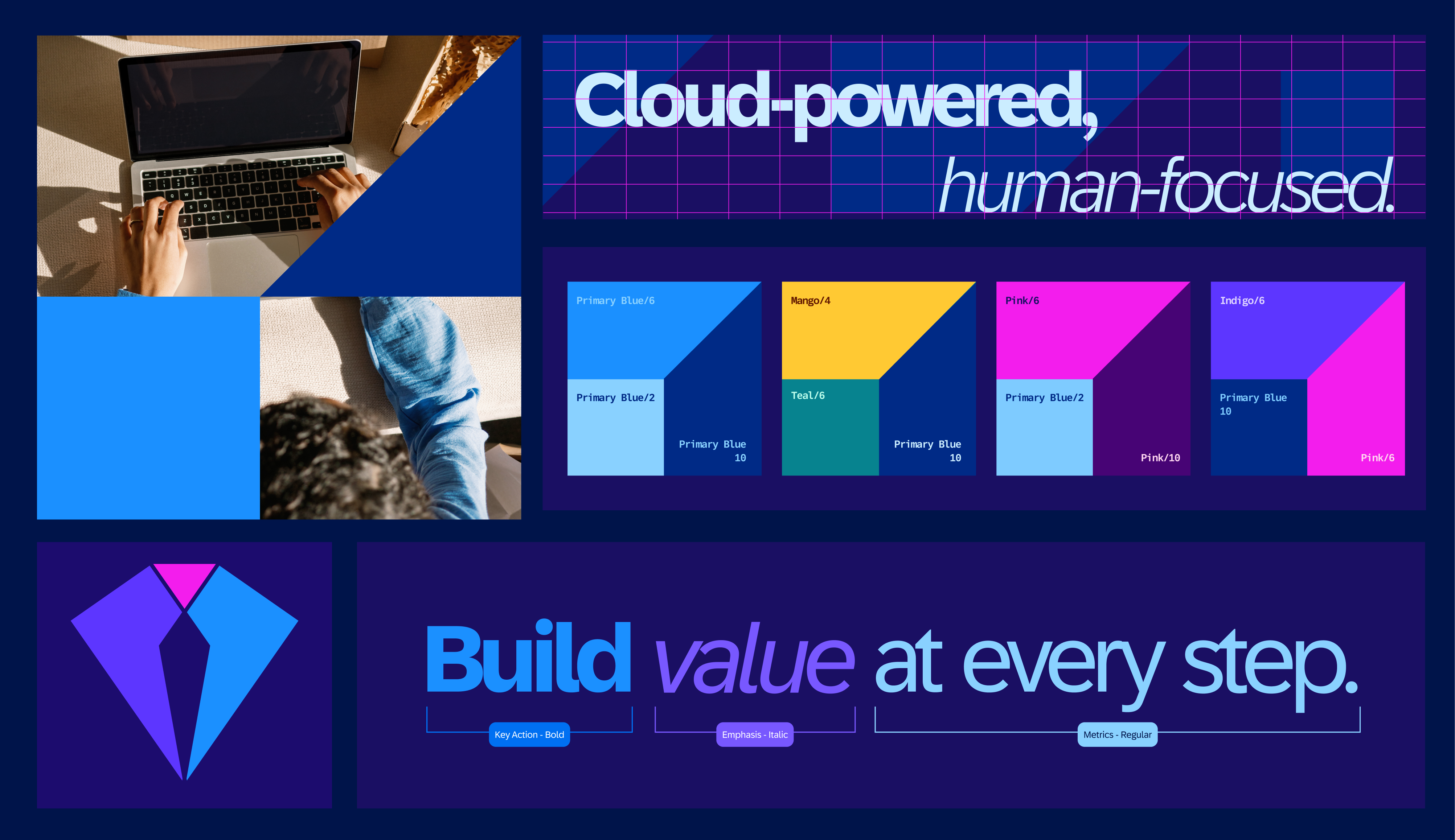
To keep the refresh grounded, we used Swiss grid principles as the structural foundation, bringing clarity, hierarchy, and consistency to the system. SAP blue remained the anchor, while expanded color pairings, expressive type, human-centered photography, and tangram-inspired geometry created more range and momentum. The result was a toolkit that could flex across campaign, digital, editorial, and environmental touchpoints while still feeling precise, credible, and recognizably SAP.
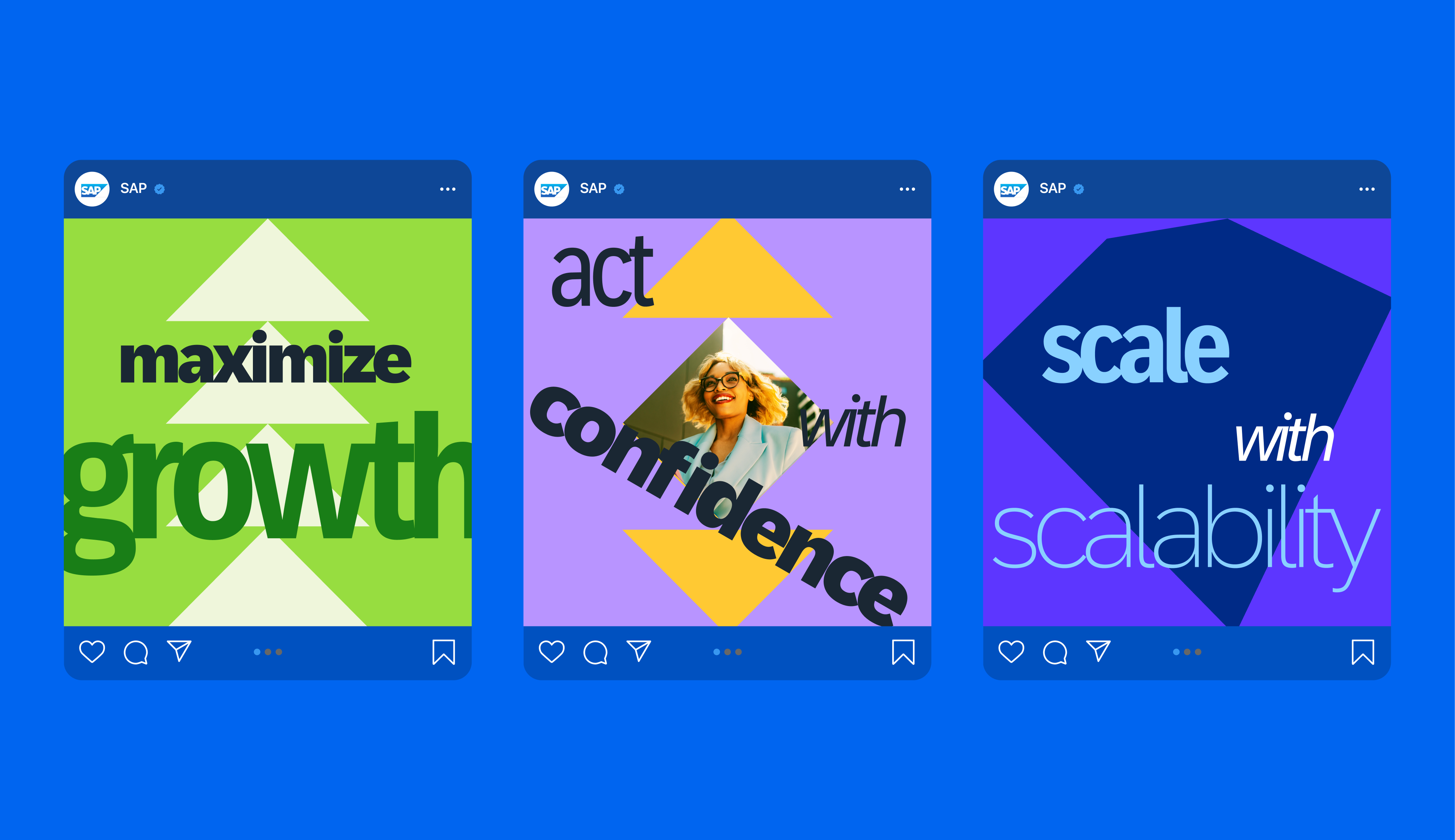
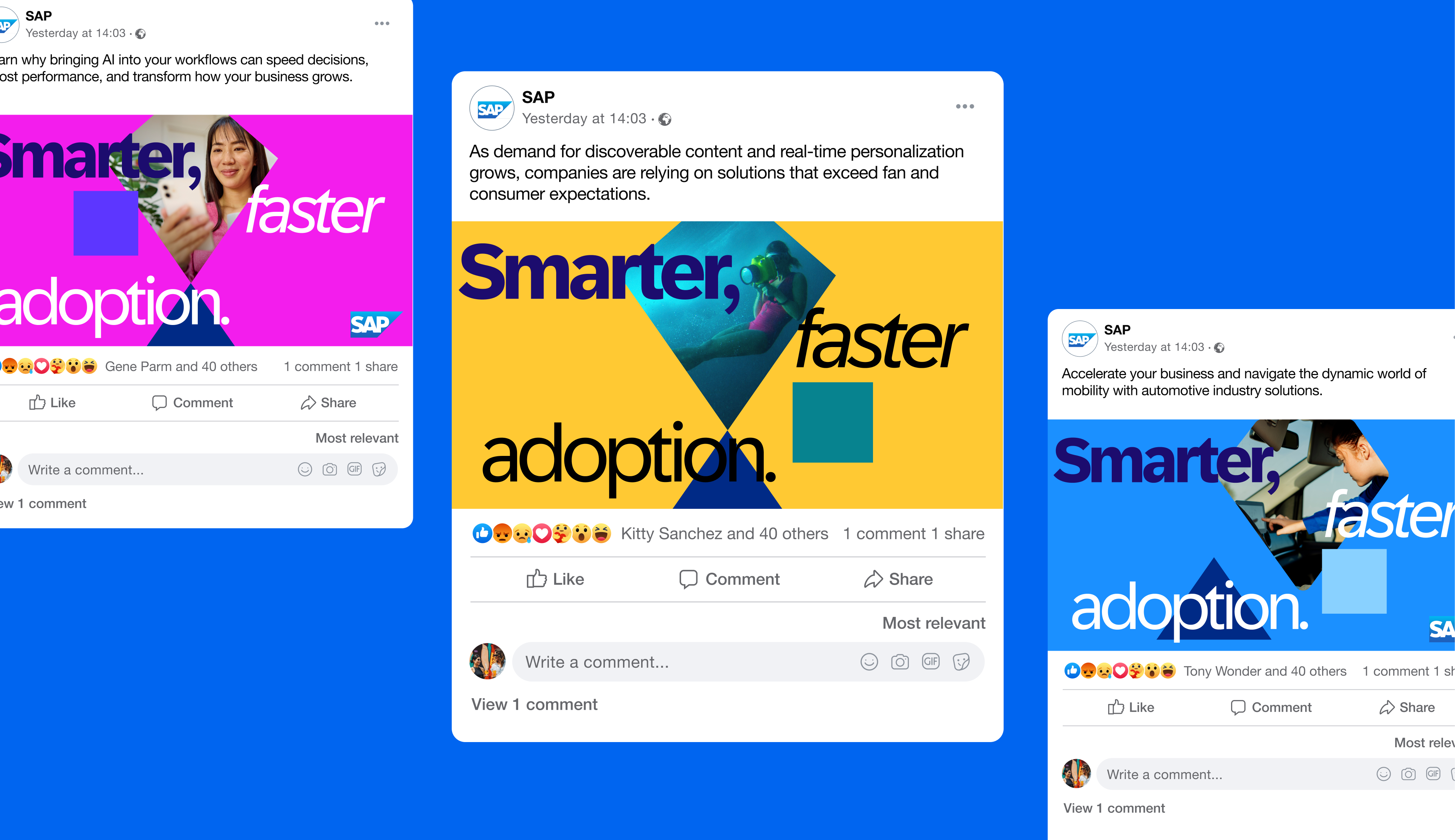
Campaign & Social Expression: Testing how the system could bring more energy and emotional range to transformation messaging.
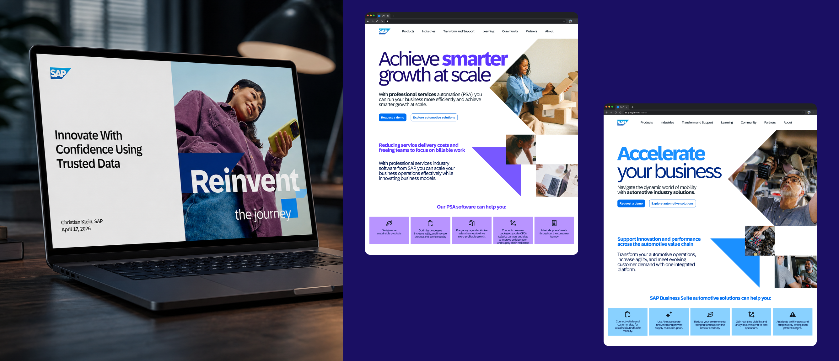
Digital & Editorial Systems: Exploring how the visual language could support hierarchy, conversion, and dense enterprise content.
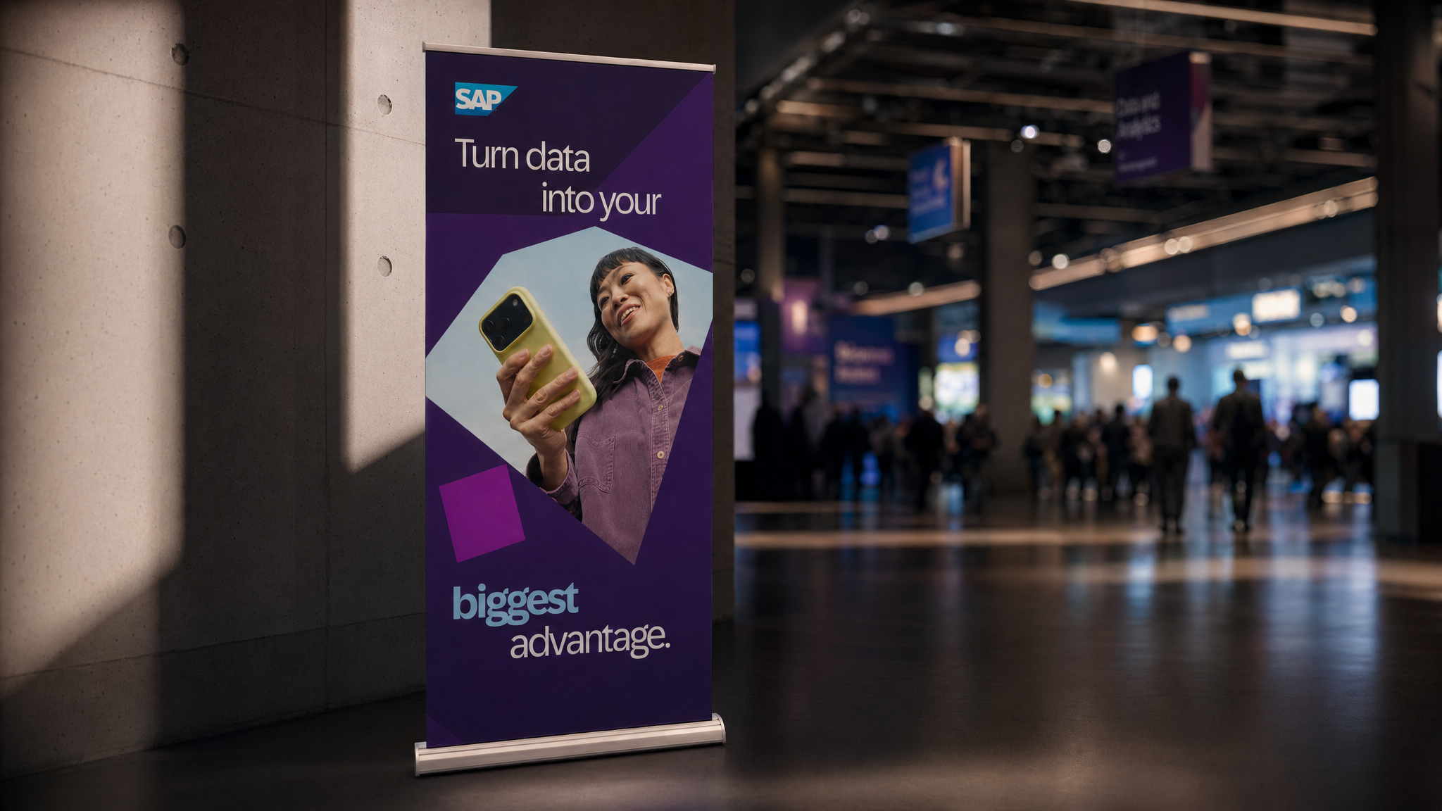
Environmental Scale
Pressure-testing the system across OOH and event environments where recognition and legibility matter quickly.
This direction expanded SAP’s visual range while preserving the brand’s most recognizable equities: blue, structure, geometry, and clarity. By translating the Anvil into a more flexible system of shape, type, color, and composition, the direction created a toolkit that could help SAP feel more human, dynamic, and future-facing across modern brand touchpoints.
Lead designers: Me, Ting Teng
Motion designer: Eileen Huang
Art director: Mike Schaeffer
Brand strategist: Andrew Cohen
Creative director: Mike Ruiz


